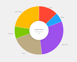
You may have seen those cool pictures of what families from around the world eat (PDF link to pictures here). Here is another visualization from the National Geographic. Look at the bottom to see a time line and how the diets have changed over the years.


Comments
Post a Comment